Introduction
There are some TV shows out there that watchers and followers cannot decide who the main/leading character is. For instance, Game of Thrones, Friends, The Office … The examples can go a little longer. Screen time might be a good indicator of the main character. In Game of Thrones TV show, for example, Tyrion Lannister (aka the Imp) has the most screen time. That’s why I believe he is the main character of the show, instead of Daenerys Targaryen, or Jon Snow, or any other Stark kids.
What about the Friends? The TV show “Friends” has captivated audiences for decades with its humor, relatable characters, and unforgettable moments. Have you ever wondered who the leading character of Friends is? Or how their dialogue trends change over time? Today, we will find out with data. Using the friends R package, we analyzed the show’s main characters to uncover insights into their dialogue patterns. This is a fun way to practice R, wrangle some data, and visualize it. Along with the friends package, we will use the dplyr, tidyr, ggplot2, and ggimage packages.
Getting Started
Let’s start by loading the necessary libraries and datasets.
The friends package contains three datasets: friends, friends_emotions, and friends_info. The friends dataset contains dialogue transcripts, while friends_emotions provides annotations of emotions associated with dialogues. The friends_info dataset contains metadata about the show’s episodes.
friends: Contains dialogue transcripts.
friends_emotions: Annotations of emotions associated with dialogues.
friends_info: Metadata about the show’s episodes.
Let’s load and define all of these datasets. You can see the first 6 rows of each dataset by using the head() function. Execute and try the code. You might try other functions like tail(), str(), summary() to gain insight about the datasets.
Preprocessing Data
If you understood the dataset, we can continue to the next step. We will preprocess the data to gain insights from the show. First of all, let’s find out who the 6 main characters are. We will do this by counting the number of distinct texts each character has in the dataset. The output will be the top 6 characters with the most dialogue.
top_6 <- df_friends %>%
  group_by(speaker) %>%
  summarise(count = n_distinct(text)) %>%
  top_n(6, count) %>%
  pull(speaker)

print(top_6)
[1] "Chandler Bing" "Joey Tribbiani" "Monica Geller" "Phoebe Buffay"
[5] "Rachel Green" "Ross Geller" Ok, we can see the 6 characters with the most utterances in the show. Obviously, these are Rachel, Ross, Chandler, Joey, Monica, and Phoebe. I am not interested in other characters in the show for this analysis. So, I will filter the dataset for only these 6 characters, and name this table df_main_roles. Finally, I will create a new dataset, showing each one of these characters’ dialogue count per season, called uttr_count_per_season. See its first 10 rows in the output below.
df_main_roles <- df_friends %>%
  filter(speaker %in% top_6)

uttr_count_per_season <- df_main_roles %>%
  group_by(speaker, season) %>%
  summarise(count = n_distinct(text)) %>%
  arrange(desc(count))

head(uttr_count_per_season, 10)
# A tibble: 10 × 3
# Groups: speaker [4]
speaker season count
<chr> <int> <int>
1 Rachel Green 7 997
2 Rachel Green 8 970
3 Ross Geller 3 966
4 Chandler Bing 6 941
5 Ross Geller 1 930
6 Rachel Green 6 909
7 Ross Geller 8 908
8 Chandler Bing 4 895
9 Joey Tribbiani 5 886
10 Rachel Green 4 879Main Role of Each Season
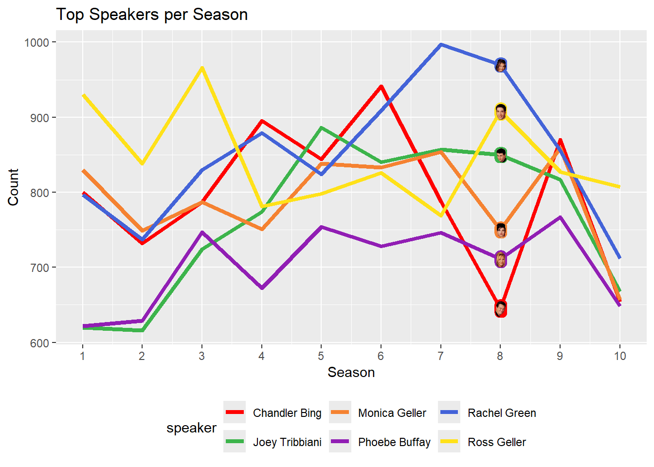
So we already have an opinion about the main character for each season. For instance, Rachel Green is the character with the most utterances in seasons 7 and 8, those also being the top two among all seasons and characters. Is Rachel our main character? uttr_count_per_season is still too raw to make a decision. Let’s visualize the data to see the trends more clearly. Following code snippet will create a line plot showing the utterance count of each character per season.
main_role_per_season <- uttr_count_per_season %>%
  spread(key = season, value = count) %>%
  ungroup() %>% # ungroup to use rowMeans because  when it is being applied to a grouped data frame, it will return multiple values instead of a single value for each group
  mutate(average = as.integer(rowMeans(.[,2:11], na.rm = TRUE))) %>%
  arrange(desc(average))

print(main_role_per_season)
# A tibble: 6 × 12
speaker `1` `2` `3` `4` `5` `6` `7` `8` `9` `10` average
<chr> <int> <int> <int> <int> <int> <int> <int> <int> <int> <int> <int>
1 Rachel Gr… 797 737 830 879 824 909 997 970 856 712 851
2 Ross Gell… 930 838 966 781 798 826 769 908 827 807 845
3 Chandler … 800 732 787 895 844 941 788 645 870 654 795
4 Monica Ge… 830 749 787 751 838 833 854 750 859 657 790
5 Joey Trib… 620 616 724 774 886 840 857 850 817 668 765
6 Phoebe Bu… 622 629 747 672 754 728 746 711 767 648 702Do you have a gist? Let’s draw a line plot to understand better. Let me add some images to the plot, too, in order to make it funnier. First, add the image file names to the uttr_count_per_season dataset. As I plotted this beforehand, I know exactly where the images would look the best. It is the 8th season, because that is where all characters are distinct from each other. So, let’s set the image location to the 8th season by defining img_loc. Also I will create a color palette for each character to use in the plots later. Finally, plot the line plot with images.
uttr_count_per_season <- uttr_count_per_season %>%
  mutate(avatar = paste0(speaker, ".png"))

img_loc <- uttr_count_per_season %>%
  filter(season == 8)


speaker_colors <- c(
  "Rachel Green" = "#4363d8",
  "Ross Geller" = "#ffe119",
  "Chandler Bing" = "#ff0000",
  "Joey Tribbiani" = "#3cb44b",
  "Monica Geller" = "#f58231",
  "Phoebe Buffay" = "#911eb4"
)


ggplot(uttr_count_per_season, aes(x = season, y = count, group = speaker, color = speaker)) +
  geom_line(linewidth = 1.5) +
  scale_color_manual(values = speaker_colors) +
  geom_image(data = img_loc, aes(x = season, y = count, group = speaker, image = avatar),
             size = 0.04, inherit.aes = FALSE) +
  labs(title = "Top Speakers per Season", x = "Season", y = "Count") +
  theme(legend.position = "bottom") +
  scale_x_continuous(breaks = 1:10, limits = c(1, 10))
ggplot is a powerful tool for data visualization. This plot gives a lot of information already. So, first of all, Ross had the scene most for the first 3 seasons. He lost it to Chandler in season 4. But the most democratic season was the 5th, where the utterances of all characters were the closest to each other. And about season 5, I also like that Joey had the most scenes. After season 6, though, Rachel took the lead and kept it until the end of the show. So, we can say, Ross started as the main character, but mid seasons were really a race for all characters. And obviously Rachel won this race.
Emotions
Another interesting analysis could be about the emotions of the characters. If you haven’t investigated emotions data, go top and wrangle. We will join the df_friends and df_emotions datasets on season, episode, scene and utterance columns to see the most common emotions of the main characters. There are many utterances without a tag of emotion, so filter any NA in emotions. Also filter all the other speakers, except our main 6 characters. To understand better let’s also print the unique emotions listed in the table.
d_w_emotions <- left_join(df_friends, friends::friends_emotions, by = c("season", "episode", "scene", "utterance")) %>%
  filter(!is.na(emotion)) %>%
  filter(speaker %in% top_6)


unique(d_w_emotions$emotion)
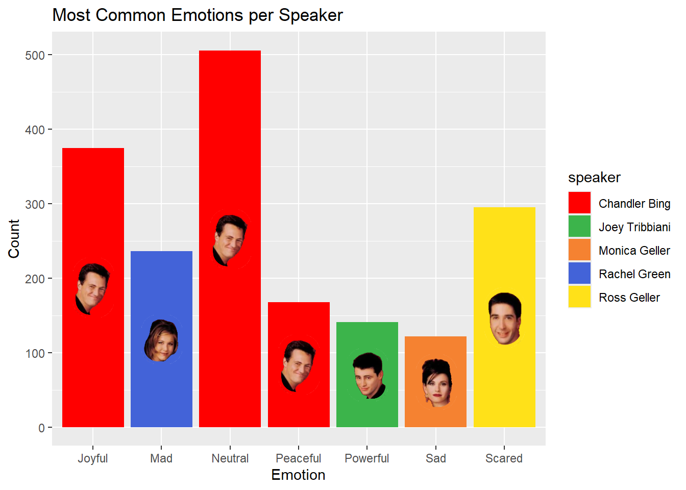
[1] "Mad" "Neutral" "Joyful" "Scared" "Sad" "Powerful" "Peaceful"There are 7 distinct emotions. Using that joint dataset, d_w_emotions, we will find out who has each emotion the most. The output will be a bar plot showing the most common emotions per speaker. For our plot, we need to count the unique texts for each speaker and emotion. Meaning, there will be a count for each speaker (6 in total) and emotion (7 in total). So, there will be 6*7=42 rows in the table.
emotion_counts <- d_w_emotions %>%
  group_by(speaker, emotion) %>%
  summarise(count = n_distinct(text)) %>%
  arrange(desc(count))
emotion_counts
# A tibble: 42 × 3
# Groups: speaker [6]
speaker emotion count
<chr> <chr> <int>
1 Chandler Bing Neutral 506
2 Ross Geller Neutral 447
3 Monica Geller Neutral 425
4 Joey Tribbiani Neutral 422
5 Phoebe Buffay Neutral 395
6 Chandler Bing Joyful 375
7 Phoebe Buffay Joyful 372
8 Rachel Green Neutral 366
9 Joey Tribbiani Joyful 355
10 Monica Geller Joyful 314
# ℹ 32 more rowsThen, we will filter the most common emotion for each speaker. Finally, we will add images to the plot to make it more fun. So we will have 7 rows, one for each emotion, and there will be speakers, who feels that emotion the most in the show, next to each emotion.
highest_emotion_counts <- emotion_counts %>%
  group_by(emotion) %>%
  filter(count == max(count)) %>%
  mutate(avatar = paste0(speaker, ".png"))

print(highest_emotion_counts)
# A tibble: 7 × 4
# Groups: emotion [7]
speaker emotion count avatar
<chr> <chr> <int> <chr>
1 Chandler Bing Neutral 506 Chandler Bing.png
2 Chandler Bing Joyful 375 Chandler Bing.png
3 Ross Geller Scared 295 Ross Geller.png
4 Rachel Green Mad 236 Rachel Green.png
5 Chandler Bing Peaceful 168 Chandler Bing.png
6 Joey Tribbiani Powerful 141 Joey Tribbiani.png
7 Monica Geller Sad 122 Monica Geller.png Nice, let’s plot this:
ggplot(highest_emotion_counts, aes(x = emotion, y = count, fill = speaker)) +
  geom_bar(stat = "identity", position = position_dodge(width = 0.9)) +
  scale_fill_manual(values = speaker_colors) +
  labs(title = "Most Common Emotions per Speaker", x = "Emotion", y = "Count") +
  geom_image(aes(x = emotion, y = count - (count/2), group = speaker, image = avatar),
             position = position_dodge(width = 0.9), size = 0.1, inherit.aes = FALSE)
Here, we simply use ggplot() function to create a bar plot. We use geom_bar() to create the bars, and geom_image() to add images to the plot. We also use scale_fill_manual() to set the colors of the bars. There are two aes() calls in this code: first defines the aestetic features of the plot, such as x and y axes, and the second one defines the image location. In fact, all functions take the aes() in the ggplot() by default. To override it, we use inherit.aes = FALSE in the geom_image() function. Also, in the geom_image() function, we use y = count - (count/2) adds the avatars to the middle of each bar.
When the plot is investigated, the most joyful, neutral, and peaceful character is the same person: Chandler. The maddest character is Rachel, no surprise. The saddest character is Monica (I guess her relationships are too deep for her). The most powerful character is Joey, which perfectly fits. Finally, the most scared character is Ross. That last one is no surprise, either. A clear image of his eyebrows is just in my mind right now. Just see the video if you need to remember.
Conclusion
In this post, we analyzed the main characters of the “Friends” TV show using the friends package in R. We found that Rachel Green is the leading character based on the number of dialogues per season. We also explored the most common emotions of the main characters, revealing interesting insights about their personalities. We used ggplot2 and ggimage for visualization and dplyr and tidyr for data wrangling. This exploration of “Friends” transcript data highlights the value of analyzing entertainment datasets. I really enjoyed the process. Hope you did, too.


